- Climate
No, the ocean is not ‘cooling’, contrary to viral claims – it’s been warming at an accelerating rate
Key takeaway
Scientific data clearly shows that ocean temperatures are warming at an accelerating rate and that this long-term trend has been driven by human-caused climate change. Misinformers attempt to ‘hide’ this long-term trend by zooming in on shorter time periods with strong El Niño and La Niña events. These events can temporarily affect ocean surface temperatures in a way that does not persist over decades, and thus does not reflect long-term climate trends.
Reviewed content
Verdict:
Claim:
Global ocean temperatures have been cooling, proving there is no global warming.
Verdict detail
Inaccurate:
Global average sea surface temperatures and the total heat stored in the ocean both show accelerated warming in recent years. Scientists are highly confident that human-caused climate change is driving increased ocean warming.
Cherry-picking:
The graph shown in a recent social media post cherry picks a select date range of 2014 to 2022. That period includes strong El Niño and La Niña events, which affect short-term sea surface temperature trends. Plotting a longer-term range of data reveals a clear and accelerating warming trend.
Full Claim
A study of ocean temperatures from 2013-2022 shows that global ocean temperature anomalies have been cooling, showing there is no global warming.
Review
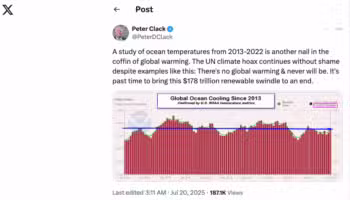
On 20 July 2025, a social media user, ‘Peter Clack’, posted an alleged graph of ocean surface temperatures on X and claimed it shows that ‘global ocean temperatures have been cooling, proving there is no global warming’.
The user even went a step further, claiming “[t]here’s no global warming & never will be” – a claim directly contradicted by an overwhelming body of scientific evidence[1], as we’ve shown in several of our past reviews. Nonetheless, the post garnered more than 186,000 views in less than a week.
Science Feedback contacted climate scientists to investigate this claim and learn more about recent ocean temperature trends – we will share these insights below and conclude the article with tips on how to avoid the misleading tactics we uncovered.
Ocean temperatures have been rising at an accelerating rate – not ‘cooling’ as shown in a misleading graph
Based on the responses Science Feedback received from climate scientists, the verdict is clear: the graph in the recent viral post is misleading, and the ocean is not ‘cooling’. In fact, it’s been warming at an accelerating rate.
Two of the main ways scientists observe how ocean temperatures are changing is by monitoring ocean heat content (OHC) – which is the total amount of heat stored in the oceans – and global mean sea surface temperature (GMSST) – the temperature of the ocean’s surface averaged across Earth. Both have been showing clear signs of warming[2,3].
When Science Feedback asked about the validity of the recent claim about ‘ocean cooling’, Dr. Ian Hall, Research Professor at Cardiff University, explained:

Ian Hall
Professor, Cardiff University
This claim is inaccurate and misleading. While short-term fluctuations in sea surface temperature can occur due to natural variability (e.g., El Niño–Southern Oscillation), the long-term trend in ocean heat content (OHC) and global mean sea surface temperature (GMSST) shows persistent and accelerating warming.
Some may still be convinced by the graph in the viral social media post – but Hall explains that it doesn’t tell the full story. When Science Feedback asked if the graph on X supports the claim, Hall explained:
Ian Hall
Professor, Cardiff University
No, it does not. The graph in question is based on a cherry-picked and statistically inappropriate time window. The period from 2014 to 2022 includes both strong El Niño and La Niña events, which can temporarily affect SSTs. However, such short-term variability does not reflect the underlying climate trend.
In other words, the graph cherry-picks a certain time period – only including some of the available data – which does not reflect the big picture.
The El Niño and La Niña events that Hall mentioned are short-term (normally around a year) disruptions to normal climate patterns above the Pacific Ocean. These events can temporarily affect sea surface temperature in a way that, if misleadingly plotted, can give the impression that the ocean is cooling.
In the same way that a savvy editor can select video clips of a long race to show one runner always taking the lead even if they lost the race, misinformers can plot short-term ocean temperature data to show a ‘cooling’ trend.
Climate change occurs over long-term scales of decades or more, and when data is plotted at that scale, a clear trend emerges: one of acceleratingA study of ocean temperatures from 2013-2022 shows that global ocean temperature anomalies have been cooling, showing there is no global warming. ocean warming (Figure 1). But Dr. Robert Kopp, Distinguished Professor at Rutgers University, explained to Science Feedback that the graph shared on X used a shorter period that doesn’t represent the long-term trend:

Robert Kopp
Distinguished Professor, Rutgers University
if you look at [Figure 1], you can see how cherrypicking results from 2014-2022 would show a period of flat global-average sea-surface temperatures.
You can see in Figure 1 below, that the small squares – which represent data points – fluctuate over short time periods, obscuring the long-term trend if looked at in isolation, while the smooth lines show the overall trend. But over the short period of 2014-2022 (see small black rectangle in Figure 1), the trend is relatively flat when looking at the thin light blue line, which shows short term fluctuations. (If you’re curious, the thicker dark blue line – which shows the longer-term trend – is rising over that period because it is created using a statistical technique that considers neighboring points, like the rise that occurred after 2022).

Kopp also created two additional plots (shown below) to demonstrate why the date range selected for the graph shared on X is misleading. In both graphs, Kopp plotted data from the National Oceanic and Atmospheric Administration (NOAA) – the same alleged data source that was used in the graph shared on X.
To evaluate if the plot on X was cherry-picked, Kopp first plotted NOAA global average sea surface temperature for the exact same period (January 2014 to June 2022) and found a relatively flat temperature trend (Figure 2). However, in the second plot (Figure 3), Kopp zoomed out to a longer period of 1900 to 2024, and a clear warming trend emerged. You can compare the two by looking at the small black box (2014 to 2022) in Figure 3 relative to the trend from 1900 to 2024.
This demonstrates how a long-term trend can be ‘hidden’ by zooming in to a specific date range.


The importance of plotting long-term data was also emphasized to Science Feedback by Dr. Richard Cornes, Senior Researcher at the National Oceanography Centre (NOC):

Richard Cornes
Senior Researcher, National Oceanography Centre (NOC)
It is also possible to get negative trends for certain segments, but again these are not statistically significant. For this reason, trends are typically calculated over a longer timeframe. […] Notably, in the period following the selected 2014-2022 range, global ocean temperatures jumped dramatically in 2023 by around 0.7°C (relative to 1991-2020 averages), fuelled partly by an extended El Nino event in combination with the long-term warming trend
Ocean warming has consequences for Earth’s climate system
Our oceans are highly efficient at storing heat, which helps stabilize Earth’s climate. However, as our oceans trap this heat and continue warming, there are several consequences for our climate system. As Hall explains to Science Feedback:
Ian Hall
Professor, Cardiff University
There is high confidence that anthropogenic greenhouse gas emissions are the primary driver of observed ocean warming. The oceans absorb over 90% of the excess heat trapped by greenhouse gases, making them a critical buffer in the Earth’s climate system.
Ocean warming has several well-documented consequences:
- Thermal expansion, contributing to sea level rise
- Increased frequency and intensity of marine heatwaves, which disrupt ecosystems and fisheries
- Accelerated melting of polar ice sheets, amplifying sea level rise
- Altered ocean circulation and weather patterns, including stronger storms and shifts in precipitation
The GMSST study[2] warns that future warming is likely to exceed the pace of the past four decades, and that linear extrapolations of past trends underestimate the rate of change. This underscores the urgency of deep reductions in fossil fuel emissions.
How can I know if a graph is misleading?
As we’ve shown above, the post and graph on X are demonstrably misleading – so how can you tell whether a graph is credible and avoid being misled? It can be tricky, no doubt, and we can’t cover everything here, but there are some signs to look out for. In short, look out for arbitrary date ranges and missing sources.
Seeing that someone plots an arbitrary date range without explaining why, that should raise your suspicions. In this case, the graph shows 2014 to 2022 – so you might ask ‘it’s 2025 now – three years after the end of their date range – and we presumably have data from before 2014, so why wouldn’t they include that data?’ This is the type of question you can ask when you see a graph like this without a cited data source (where you might easily be able to find this information).
There are sometimes valid reasons to plot data for only a select date range: limited data, factors or events that affected data quality – the list goes on. But those who are transparent – like reputable research scientists – will almost always explain such reasons. In the scientific research world, for example, excluding such explanations would prevent your research from being published by reputable scientific journals.
The fact that the user on X did not explain why they chose that arbitrary date range, and also that they did not include a link to the data should be a warning sign for you. As you encounter future graphs, be on the lookout for this type of misleading tactic.
Reviewers feedback
Questions to scientists from Science Feedback:
- Is it accurate or inaccurate to claim that ‘Global ocean temperatures have been cooling, proving there is no global warming’, and why?
- The claim above relies on a graph (archived here, linked here), allegedly showing ocean temperature anomalies from 2014-2022 with a trend of -0.02°C per decade over that period. Does this graph accurately represent recent ocean temperature trends?
- Can you explain what climate scientists know about the relationship between climate change and global ocean temperatures?
Robert Kopp
Distinguished Professor, Rutgers University
There is no cite provided in the Tweet, therefore I am unable to assess whether this plot was invented by Mr. Clack or based on some study. Therefore, I am unable to evaluate the specifics of this post.
The claims of this post are not supported by measurements of global ocean heat content; see [NOAA link here] for a reliable source of information. It is also not supported by measurements of sea surface temperature, though if you look at [Figure 1] [data linked here], you can see how cherrypicking results from 2014-2022 would show a period of flat global-average sea-surface temperatures. (The NOAA NCDC site is down right now, so I can’t get the comparable NOAA data set*.) You’ll also notice that this period of relatively static global-mean sea-surface temperatures was followed by the 2 hottest years on record. My suspicion therefore is that the results Mr. Clack is showing are these cherry-picked global-mean sea-surface temperature results.
*Note: NOAA’s site came back online before publishing this article, and Kopp accessed data on it to provide Science Feedback with additional plots (Figures 2 and 3).
Ian Hall
Professor, Cardiff University
1. Is it accurate or inaccurate to claim that ‘Global ocean temperatures have been cooling, proving there is no global warming’, and why?
IH: “This claim is inaccurate and misleading. While short-term fluctuations in sea surface temperature can occur due to natural variability (e.g., El Niño–Southern Oscillation), the long-term trend in ocean heat content (OHC) and global mean sea surface temperature (GMSST) shows persistent and accelerating warming.
Recent research using satellite observations since 1985 and a statistical model incorporating climate drivers has shown that the rate of GMSST increase is accelerating, not slowing [Merchant et al. (2025)[2]]. The study found that the underlying rate of GMSST rise increased from 0.06 K [Kelvin] per decade (1985–1989) to 0.27 K per decade (2019–2023), closely tracking the rise in Earth’s energy imbalance. This acceleration is a clear signal of intensifying climate change.
Moreover, NOAA’s Global Ocean Heat Content (OHC) data confirms that 2023 and 2024 were the warmest years on record for ocean heat content, with warming observed across all major ocean basins [NOAA (2024); Cheng et al. (2023)[3]. In 2024, OHC in the upper 700 and 2000 meters hit record highs, exceeding levels from 2023. The highest 2000-meter OHC values have all been recorded in the past five years, while the 700-meter highs have occurred since 2019. With the Atlantic and Indian Oceans experiencing their highest heat content since the 1950s, and the Pacific ranking as the third warmest.”
2. Does the graph showing a -0.02°C/decade trend from 2014–2022 accurately represent recent ocean temperature trends?
IH: “No, it does not. The graph in question is based on a cherry-picked and statistically inappropriate time window. The period from 2014 to 2022 includes both strong El Niño and La Niña events, which can temporarily affect SSTs. However, such short-term variability does not reflect the underlying climate trend.
The recent GMSST study[2] shows that interannual variability alone cannot explain the record-breaking SSTs of 2023 and early 2024. In fact, 44% of the +0.22 K difference between the 2023/24 and 2015/16 El Niño peaks is attributable to the accelerating warming trend, not just natural variability.”
3. What do climate scientists know about the relationship between climate change and global ocean temperatures?
IH: “There is high confidence that anthropogenic greenhouse gas emissions are the primary driver of observed ocean warming. The oceans absorb over 90% of the excess heat trapped by greenhouse gases, making them a critical buffer in the Earth’s climate system.
Ocean warming has several well-documented consequences:
- Thermal expansion, contributing to sea level rise
- Increased frequency and intensity of marine heatwaves, which disrupt ecosystems and fisheries
- Accelerated melting of polar ice sheets, amplifying sea level rise
- Altered ocean circulation and weather patterns, including stronger storms and shifts in precipitation
The GMSST study warns that future warming is likely to exceed the pace of the past four decades, and that linear extrapolations of past trends underestimate the rate of change. This underscores the urgency of deep reductions in fossil fuel emissions.
References:
Richard Cornes
Senior Researcher, National Oceanography Centre (NOC)
Global ocean temperatures display variability on a range of time scales. Volcanic forcing, El Nino/La Nina events and variations internal to the climate system all contribute to this. However, these are all superimposed on a long-term warming that results from anthropogenic forcing. Indeed, the Intergovernmental Panel on Climate Change (IPCC) concluded that ‘most of the observed increase in global average temperatures since the mid-20th century is very likely due to the observed increase in anthropogenic greenhouse gas concentrations.’
The graph used to support this claim is based on the period January 2014 to June 2022 and it is correct that over that time-period there was not a statistically significant trend in global monthly average temperatures across the ocean. However, the trend is highly dependent on the time range considered, because of the variations described above. For example, the trend from Jan 2014-Dec 2022 was 0.0°C/decade. However, adjusting the date range by one year (Jan 2013 to Dec 2021) produces a trend of +0.13 °C/decade. It is also possible to get negative trends for certain segments, but again these are not statistically significant. For this reason, trends are typically calculated over a longer timeframe. Between the period 1880–1900 and 2019–2023, average SST over the global ocean (excluding the polar regions) has increased by around 0.9°C. Notably, in the period following the selected 2014-2022 range, global ocean temperatures jumped dramatically in 2023 by around 0.7°C (relative to 1991-2020 averages), fuelled partly by an extended El Nino event in combination with the long-term warming trend [see the steep upward spike on right-most side of Figure 3]. It’s also important to note that the air temperature over land is warming faster than the ocean surface temperature because ocean currents can act to move heat away from the surface, leading to increases in the heat stored by the ocean.
There are many online sources of high-quality information about increasing global and regional temperatures and changing climate.
- The Copernicus Climate Change Service – Climate Pulse
- Show Your Stripes
- IPCC Sixth Assessment Report
- NASA Climate Change
- Real Climate
Monthly averages of global temperature across the ocean. The trend over the period 2014-2022 is highlighted. Data from [source here]
References:
- 1 – IPCC (2023) Climate Change 2023: Synthesis Report.
- 2 – Merchant et al. (2025) Quantifying the acceleration of multidecadal global sea surface warming driven by Earth’s energy imbalance. Environmental Research letters.
- 3 – Cheng et al. (2023) Another Year of Record Heat for the Oceans. Advances in Atmospheric Sciences.


